
Tara Jensen – UX Research & Design
The Project
This project was created as part of a San Diego Adobe Creative Jam competition. A "Creative Jam" is the creative professional’s equivalent of a hack-a-thon. However, rather than writing code, contestants flex their creative muscles to create stunning visuals, animations, and innovative ideas as fast as humanly possible. Twenty hand-picked, local designers (working in teams of two), work frantically for three hours to come up with a concept and design that matches a random theme, presented to them at the start of the competition. Each team gets two minutes to present their designs (iPhone apps, in this case) to an audience of their peers and Creative Jam judges.
My Role
For this competition, I was responsible for planning our timebox schedule, leading the initial brainstorm activities, extending the design to align with whatever my teammate did in terms of style, drafting our pitch, and presenting the final prototype.
The Team
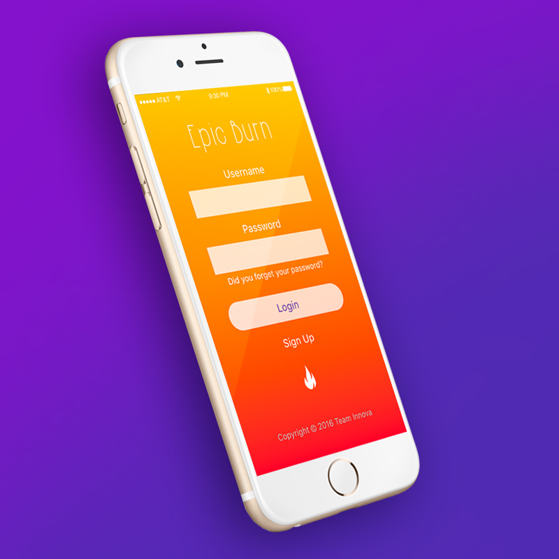
I paired up with my colleague, John Alexander, who was our visual designer and prototyper. He planned a few different sets of color schemes and fonts for us to choose from for the day of the event, intended for different moods. As visual designer, he would be in charge of the logo for our login screen. John also had more experience with Adobe XD than I had, so we designated him as our prototyper. With this role, he would also be in charge of the master file and consolidate our mockups.
Designing the App
After setting up our workstations, they announced the theme "Poke the Bear" at 5:15 pm. All we had to do was come up with and create an app that worked for the theme.
Brainstorm - 10 min
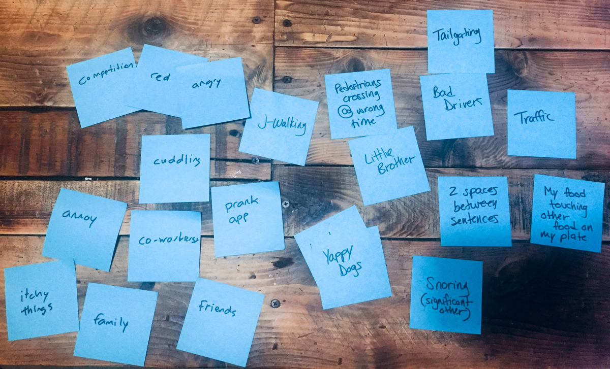
We quickly discussed our assumptions about what our competitors might do with this theme: illustrations of bears, nature themes, potentially some literal poking. We looked up the definition of "Poke the Bear" then initiated an individual post-it brainstorm of things that annoy people. 3-minute brainstorm, 3 minute share-back, and hopefully a little "yes-and..."
The plan was to brainstorm ideas off of something we identified in this brainstorm, but as soon as my teammate said the words "competitive prank app" I got excited and we were both ready to move forward.
UI Flow - 5 min
We quickly titled index cards as we talked through potential screens. First we need a login screen and a homepage. My teammate mentioned a leader board, I mentioned that maybe you could vote pranks up and down on it. I sketched this as I explained how it could work. We talked about having groups and the ability to invite people to them; like friends, family, and co-worker groups. We quickly labeled individual "Groups," "Invite," and "Friends" cards. The "Friends" page would show everyone who is in the group. Maybe that's where you select the victim of your prank, before you upload it.
From there, you need a way add the details of your prank, but what happens when you were the the target of a prank? We labeled a "Create Prank" page as we discussed an idea to potentially rank a prank that you were the victim of. That was the birth of the "Sad Panda" idea which we instantly decided would be our final screen; a hidden bear for the poke the bear theme. We thought the categories "Just Right," "Too Much," and "Not Enough" were a great way to provide feedback to other users in the app. This would allow you to learn your friend/co-worker' prank threshold. The "not enough" option might add even more of competitive nature to the app. We sketched this right away so we wouldn't forget.
We discussed potentially uploading videos of your completed pranks or possibly recording it as the prank went down. At that point we discussed how you wouldn't want to notify anyone in advance and run the risk of ruining a prank. So, maybe this is just an aftermath upload situation. Then we notify users as soon as anything new is posted. My teammate also labeled and sketched a "Create an Account" and "Profile" page, since most apps have those. I suggested we leave those out since we could pitch from the perspective of already having an account.
During the last minute left of our time box, we arranged the labeled index cards in the order we might tell the story.
Sketch & Tasking - 5 min
With a basic outline of screens, we sketched potential screen details on the labeled index cards that were still blank. We didn't waste time on the login screen since we already had a template to start with.
For the homepage, we talked about featuring pranks you've voted up with a navigation bar at the bottom where you could prompt certain interactions or navigate between sections. Then we thought, maybe we could cut the home screen. It might not make sense to look at a collection of pranks that could've come from different groups you're a part of. Instead, the "Groups" page could be your first screen after login. Then, you could click into a group and land on that group's leader board, or you could have notifications. This prompted us to sketch a bell icon in the corner of the "Groups" card. That would be our lead-in to a group invite for our pitch. We rearranged the cards.
John quickly sketched the video screen with an option to view or add videos. I finished the Groups sketch and a simple "Friends" screen. For the invite card, we discussed featuring the person who invited you in a larger photo, with other members of the group displayed at a smaller size. This could help you decide whether to accept or decline an invite. The "Create Prank" could have a similar layout featuring a large photo of your victim. If you land on this page without selecting a friend first, maybe instead of a photo, it's a "+" icon that prompts you to select a friend.
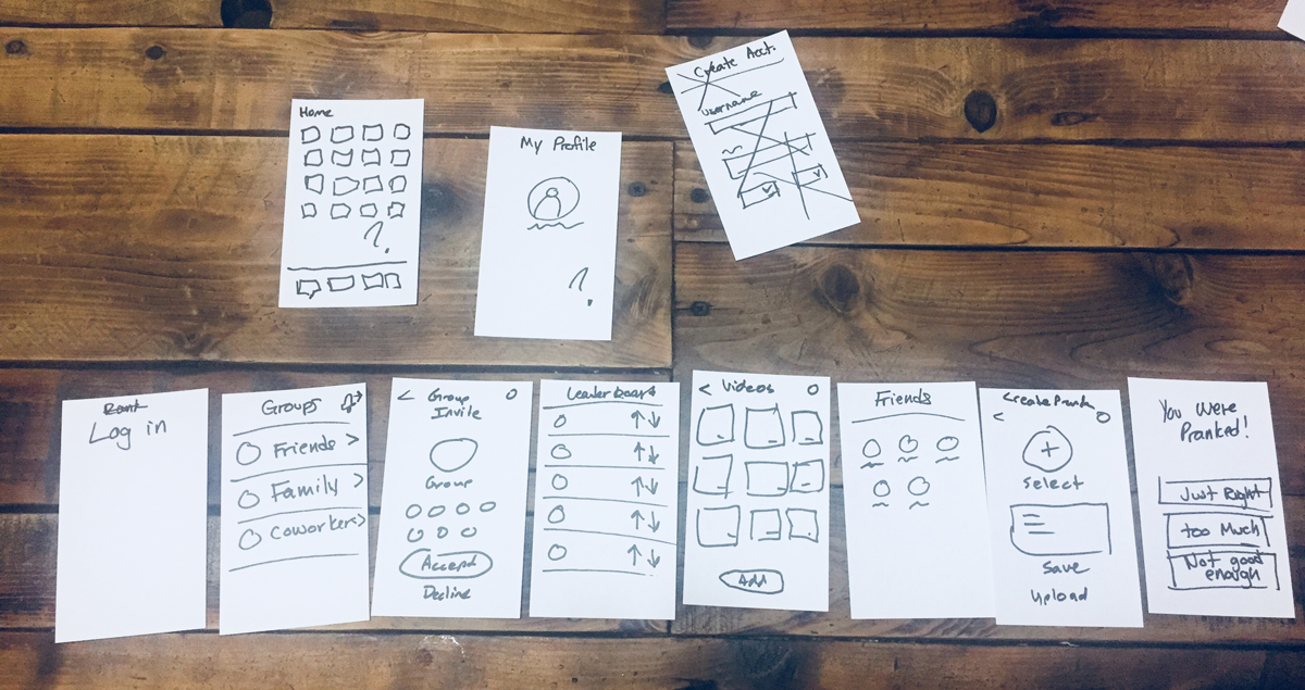
After visualizing our final arrangement of screens, we each grabbed the index cards that represented the screens we agreed to take on. I grabbed "Groups," "Invite," "Leader board," and the "You Were Pranked" cards, John grabbed the rest.
Mockups - 1 hour, 40 min
We hit our workstations, quickly agreeing on fonts and color schemes. John busted out screens like rapid fire. As I created my screens, I repeatedly looked over his shoulder to make sure I followed his lead on button and image style, size, placement, padding, etc. With such little time, I wanted to do everything I could to make it feel like you were in the same app no matter whose screen you were on.
This stage was basically just generate screens, then duplicate them to make slight adjustments for the prototype.
Prototype and Pitch Development - 1 hour
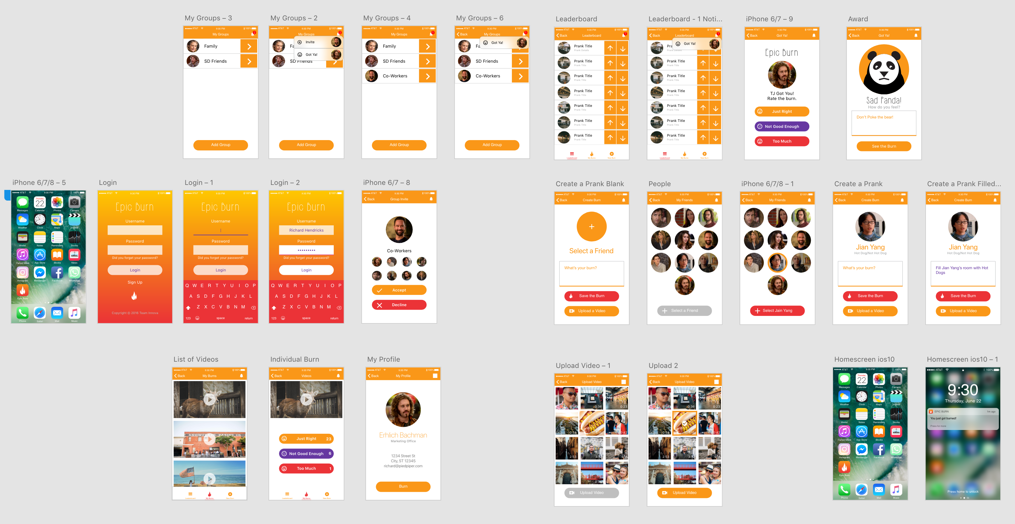
When we hit the final hour, John merged our mockups together and used the screens below to begin prototyping (we used all but the first three in the bottom row).
As he prototyped I drafted the two-minute pitch for our prototype. I tried to focus on a relatable story with a bit of humor. We ended up with story about your boss inviting you to a co-working group in an effort to build closer relationships among colleagues, for the benefit of company culture. After all, a well intentioned prank can actually have a positive effect on relationships. As long as no one takes it too far.
In the final 10 minutes, things got a little stressful trying to arrange the interactions in alignment with the story. I stepped in for the last few interactions to make sure it lined up with the story and I knew where to click and in which order in order to hit our hidden "sad panda" bear before our time was up.
This is the final prototype that won us the People's Choice Award.